[TIL/Coin Site Project] 2023/11/27
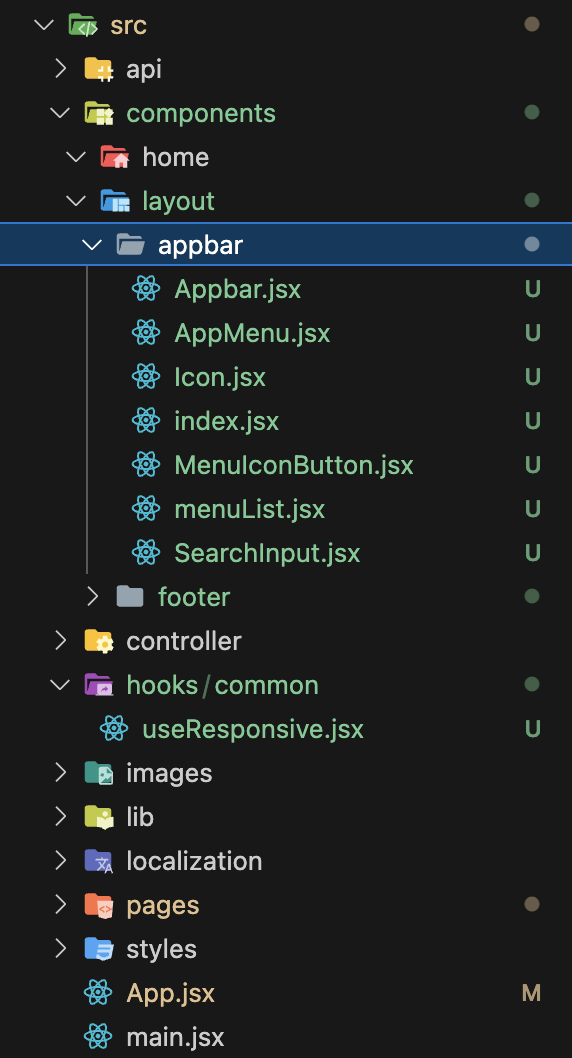
파일 구조 ✍️ 오늘의 핵심 파일 src/components/layout/appbar src/hooks/common/useResponsive.jsx > 1. src/components/layout/appbar/index.jsx 🟢 MUI에서 Appbar에 대한
파일 구조 ✍️
오늘의 핵심 파일
1. src/components/layout/appbar 2. src/hooks/common/useResponsive.jsx
1. src/components/layout/appbar/index.jsx 🟢
MUI에서 Appbar에 대한 컴포넌트 코드를 긁어왔다. 파일의 효율적 관리를 위해 세부적인 내용들을 개별 컴포넌트로 분리했고, 각각의 컴포넌트들은 단일한 index.jsx 파일로부터 export 된다.
import Icon from "./Icon";
import SearchInput from "./SearchInput";
import AppMenu from "./AppMenu";
import MenuIconButton from "./MenuIconButton";

export { Icon, SearchInput, AppMenu, MenuIconButton };
2. src/components/layout/appbar/Icon.jsx 🟢
사이트의 Icon을 담당할 파일이다. 현재는 Typography를 통해 영역만 확보해놓은 상황이다.
import React from "react";
import { Box, Typography } from "@mui/material";

const Icon = () => {
  return (
    <Box>
      <Typography variant="h6" noWrap component="div">
        MUI
      </Typography>
    </Box>
  );
};

export default Icon;
3. src/components/layout/appbar/SearchInput.jsx 🟢
import React from "react";
import SearchIcon from "@mui/icons-material/Search";
import { styled, alpha } from "@mui/material/styles";
import { Box, InputBase } from "@mui/material";

const SearchIconWrapper = styled("div")(({ theme }) => ({
  padding: theme.spacing(0, 2),
  height: "100%",
  position: "absolute",
  pointerEvents: "none",
  display: "flex",
  alignItems: "center",
  justifyContent: "center",
}));

const StyledInputBase = styled(InputBase)(({ theme }) => ({
  color: "inherit",
  "& .MuiInputBase-input": {
    padding: theme.spacing(1, 1, 1, 0),
    paddingLeft: `calc(1em + ${theme.spacing(4)})`,
    transition: theme.transitions.create("width"),
    width: "100%",
    [theme.breakpoints.up("md")]: {
      width: "20ch",
    },
  },
}));

const SearchInput = () => {
  return (
    <Box
      sx={{
        position: "relative",
        borderRadius: (theme) => theme.shape.borderRadius,
        backgroundColor: (theme) => alpha(theme.palette.common.white, 0.15),
        "&:hover": {
          backgroundColor: (theme) => alpha(theme.palette.common.white, 0.25),
        },
        marginRight: (theme) => theme.spacing(2),
        marginLeft: 0,
        width: { sm: "auto", sx: "100%" },
        marginLeft: { sm: 5 },
      }}
    >
      <SearchIconWrapper>
        <SearchIcon />
      </SearchIconWrapper>
      <StyledInputBase
        placeholder="Search…"
        inputProps={{ "aria-label": "search" }}
      />
    </Box>
  );
};

export default SearchInput;
4. src/components/layout/appbar/AppMenu.jsx 🟢
import React from "react";
import { Box, Button } from "@mui/material";
import { menuList } from "./menuList";

const AppMenu = () => {
  return (
    <Box
      sx={{
        flex: 1,
        display: "flex",
        padding: "0 40px",
        columnGap: "25px",
      }}
    >
      {menuList?.map((menu) => (
        <Button key={menu?.name}>{menu?.name}</Button>
      ))}
    </Box>
  );
};

export default AppMenu;
5. src/components/layout/appbar/MenuIconButton.jsx 🟢
import React from "react";
import { Box, IconButton } from "@mui/material";
import MenuIcon from "@mui/icons-material/Menu";

const MenuIconButton = () => {
  return (
    <Box>
      <IconButton
        size="large"
        edge="start"
        color="inherit"
        aria-label="open drawer"
        sx={{ mr: 2 }}
      >
        <MenuIcon />
      </IconButton>
    </Box>
  );
};

export default MenuIconButton;
6. src/components/layout/appbar/menuList.jsx 🟢
export const menuList = [
  { name: "메뉴 1", path: "/" },
  { name: "메뉴 2", path: "/" },
  { name: "메뉴 3", path: "/" },
  { name: "메뉴 4", path: "/" },
];
7. src/components/layout/appbar/Appbar.jsx 🟢
import * as React from "react";
import { AppBar, Box, Container } from "@mui/material";

import {
  Icon,
  AppMenu,
  MenuIconButton,
  SearchInput,
} from "@/components/layout/appbar";
import useResponsive from "@/hooks/common/useResponsive";

export default function PrimarySearchAppBar() {
  const { renderBasedOnResponsive } = useResponsive();

  return (
    <Box>
      <AppBar
        position="sticky"
        sx={{ zIndex: 999, top: 0, backgroundColor: "black" }}
      >
        <Container
          sx={{
            display: "flex",
            padding: { lg: "0 20px", xs: "0 16px" },
            alignItems: "center",
          }}
          disableGutters
        >
          {/* Component 1 */}
          <Icon sx={{ display: { xs: "none", sm: "block" } }} />
          {/* Component 2, 조건부 렌더링 */}
          {renderBasedOnResponsive(
            () => (
              <SearchInput />
            ),
            () => (
              <AppMenu />
            )
          )}

          {/* Component 3 */}
          <MenuIconButton />
        </Container>
      </AppBar>
    </Box>
  );
}
8. src/hooks/common/useResponsive.jsx 🟣
import { useMediaQuery } from "@mui/material";

const useResponsive = () => {
  const isMobile = useMediaQuery((theme) => theme.breakpoints.down("lg"));

  const renderBasedOnResponsive = (
    componentsForMobile,
    componentsForDesktop
  ) => {
    return isMobile ? componentsForMobile() : componentsForDesktop();
  };

  return { isMobile, renderBasedOnResponsive };
};

export default useResponsive;
요약 🔵
1. MUI에서 Appbar에 대한 코드를 긁어옴 2. 효율적인 관리를 위해, 해당 코드를 component 단위로 분리함 3. 분리된 components를 index.jsx로 모아서 export 함 4. 반응형에 필요한 상태를 통합적으로 관리하기 위해, useResponsive라는 커스텀 훅으로 분리함
More to read
프론트엔드와 백엔드 사이
HTTP 상태 코드는 프론트엔드에서 백엔드로 보냈던 요청의 수행 결과를 의미하는 일종의 약속이며, API를 구성하는 핵심 요소 중 하나입니다. 상태 코드와 관련하여, 백엔드는 잘 모르는 프론트엔드의 슬픈 사정이 있습니다.아래는 요청이 실패했음에도, 백엔드에서 상태 코드
JWT토큰 관리 방식 톺아보기
0. 들어가며 🎯 서비스에 접근하려는 사용자가 누구인지 확인하는 과정을 사용자 인증이라고 합니다. 인증된 사용자에게 주어진 권한을 확인하는 작업은 인가라고 부릅니다. 이번 글에서는 인가는 다루지 않습니다. 사용자 인증에는 많은 방식이 있지만, 오늘은 세션 인증 방
A2AA2A / MCP 멀티 에이전트 오케스트레이션
0. 들어가며 ✍️ Google for Developers에, 레스토랑 공급망 시나리오로 엮은 6대 프로토콜(MCP, A2A, UCP, AP2, A2UI, AG-UI)에 대한 가이드가 게시된 이후, MCP와 A2A부터 구현해 보는 것이 좋을 것 같다는 생각이 들었습니