[TIL/Coin Site Project] 2023/11/24
MUI, Grid System ✍️reference: https://www.youtube.com/watch?v=eYGIIc2FOVIhttps://mui.com/material-ui/react-grid/MUI를 사용하여 프로젝트를 진행하기로 기획했다.
MUI, Grid System ✍️
reference: https://www.youtube.com/watch?v=eYGIIc2FOVI https://mui.com/material-ui/react-grid/
1. 학습 이유
MUI를 사용하여 프로젝트를 진행하기로 기획했다. 상태관리든 통신이든, 일단 View를 그릴 줄 알아야 의미가 있지 않겠나. MUI를 자유롭게 사용하기 위해서는 다양한 개념에 대한 이해가 전제되어야겠지만, 반응형 구현을 위한 학습이 우선이라고 생각했다. 이러한 생각의 흐름을 통해, Grid System을 배워야 겠다고 결정했다.
2. MUI로 작성한 첫 코드

화면의 크기와 방향에 있어서 레이아웃의 일관성을 보장하기 위해 사용하는 것이 Grid라고 한다. "속성으로 레이아웃을 조정하겠구나"라는 상식적인 추론이 가능하다.
import React from "react";
import {
  Grid,
  Card,
  CardActionArea,
  CardMedia,
  CardContent,
  Typography,
} from "@mui/material";

const Layout = () => {
  return (
    <div>
      {/* Grid Container */}
      <Grid container spacing={3}>
        {/* Grid Item 1 */}
        <Grid item xs={3} md={2.4} lg={2}>
          <Card sx={{ maxWidth: 345 }}>
            <CardActionArea>
              <CardMedia
                component="img"
                height="140"
                image="https://mui.com/static/images/cards/contemplative-reptile.jpg"
                alt="green iguana"
              />
              <CardContent>
                <Typography gutterBottom variant="h5" component="div">
                  Lizard
                </Typography>
                <Typography variant="body2" color="text.secondary">
                  Lizards are a widespread group of squamate reptiles, with over
                  6,000 species, ranging across all continents except Antarctica
                </Typography>
              </CardContent>
            </CardActionArea>
          </Card>
        </Grid>
        {/* Grid Item 2 */}
        <Grid item xs={3} md={2.4} lg={2}>
          <Card sx={{ maxWidth: 345 }}>
            <CardActionArea>
              <CardMedia
                component="img"
                height="140"
                image="https://mui.com/static/images/cards/contemplative-reptile.jpg"
                alt="green iguana"
              />
              <CardContent>
                <Typography gutterBottom variant="h5" component="div">
                  Lizard
                </Typography>
                <Typography variant="body2" color="text.secondary">
                  Lizards are a widespread group of squamate reptiles, with over
                  6,000 species, ranging across all continents except Antarctica
                </Typography>
              </CardContent>
            </CardActionArea>
          </Card>
        </Grid>
        {/* Grid Item 3 */}
        <Grid item xs={3} md={2.4} lg={2}>
          <Card sx={{ maxWidth: 345 }}>
            <CardActionArea>
              <CardMedia
                component="img"
                height="140"
                image="https://mui.com/static/images/cards/contemplative-reptile.jpg"
                alt="green iguana"
              />
              <CardContent>
                <Typography gutterBottom variant="h5" component="div">
                  Lizard
                </Typography>
                <Typography variant="body2" color="text.secondary">
                  Lizards are a widespread group of squamate reptiles, with over
                  6,000 species, ranging across all continents except Antarctica
                </Typography>
              </CardContent>
            </CardActionArea>
          </Card>
        </Grid>
        {/* Grid Item 4 */}
        <Grid item xs={3} md={2.4} lg={2}>
          <Card sx={{ maxWidth: 345 }}>
            <CardActionArea>
              <CardMedia
                component="img"
                height="140"
                image="https://mui.com/static/images/cards/contemplative-reptile.jpg"
                alt="green iguana"
              />
              <CardContent>
                <Typography gutterBottom variant="h5" component="div">
                  Lizard
                </Typography>
                <Typography variant="body2" color="text.secondary">
                  Lizards are a widespread group of squamate reptiles, with over
                  6,000 species, ranging across all continents except Antarctica
                </Typography>
              </CardContent>
            </CardActionArea>
          </Card>
        </Grid>
        {/* Grid Item 5 */}
        <Grid item xs={3} md={2.4} lg={2}>
          <Card sx={{ maxWidth: 345 }}>
            <CardActionArea>
              <CardMedia
                component="img"
                height="140"
                image="https://mui.com/static/images/cards/contemplative-reptile.jpg"
                alt="green iguana"
              />
              <CardContent>
                <Typography gutterBottom variant="h5" component="div">
                  Lizard
                </Typography>
                <Typography variant="body2" color="text.secondary">
                  Lizards are a widespread group of squamate reptiles, with over
                  6,000 species, ranging across all continents except Antarctica
                </Typography>
              </CardContent>
            </CardActionArea>
          </Card>
        </Grid>
        {/* Grid Item 6 */}
        <Grid item xs={3} md={2.4} lg={2}>
          <Card sx={{ maxWidth: 345 }}>
            <CardActionArea>
              <CardMedia
                component="img"
                height="140"
                image="https://mui.com/static/images/cards/contemplative-reptile.jpg"
                alt="green iguana"
              />
              <CardContent>
                <Typography gutterBottom variant="h5" component="div">
                  Lizard
                </Typography>
                <Typography variant="body2" color="text.secondary">
                  Lizards are a widespread group of squamate reptiles, with over
                  6,000 species, ranging across all continents except Antarctica
                </Typography>
              </CardContent>
            </CardActionArea>
          </Card>
        </Grid>
      </Grid>
    </div>
  );
};

export default Layout;
큰 틀에서 보면 두 개의 Grid가 있다. 하나는 container의 역할을 수행하는 Grid이고, 다른 하나는 item으로서의 Grid이다.
#### 2-1. spacing
spacing={3}은 그리드 아이템 사이의 간격을 나타낸다.
spacing을 7로 설정했을 때의 모습이다. ~~MUI에서의 'column gap'이라고 보면 될 것 같다.~~
정정: 공식문서를 확인해보니 Row & column spacing이 따로 있다.
#### 2-2. xs(대략 0px~600px)
xs는 왜 xs일까? xs는 'extra small'을 나타낸다. 가장 작은 화면 크기 또는 최소한의 화면 크기를 의미하는 것이다. styled-components를 사용할 때로 생각해보면, min-width 정도를 의미하는 것 같다. xs의 최대값은 12이다.
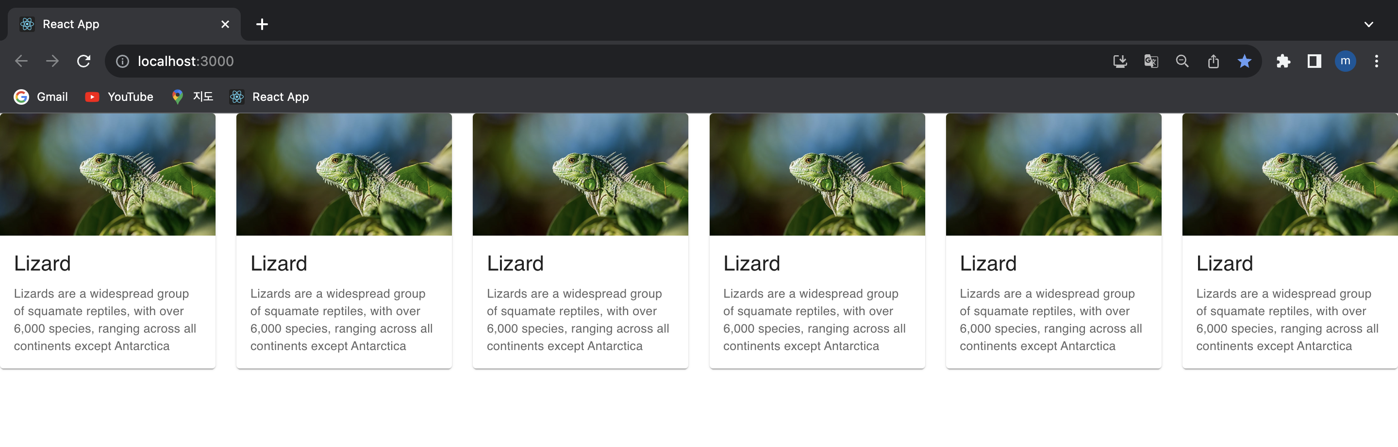
즉 xs={12}이면 가장 작은 화면에서 해당 item이 전체 width를 차지한다는 것이다. 개별 item에 대해 모두 xs={4}를 적용해봤다. 가장 작은 화면이 될때 한 row에 제시되는 카드는 3개여야 한다.
예상한 그대로 나왔다.
#### 2-3. sm(대략 600px~960px)
small size에 대한 레이아웃 조정 속성도 있다. 위 코드에서 다루지 않았을 뿐이다.
#### 2-4. md(대략 960px~1280px)
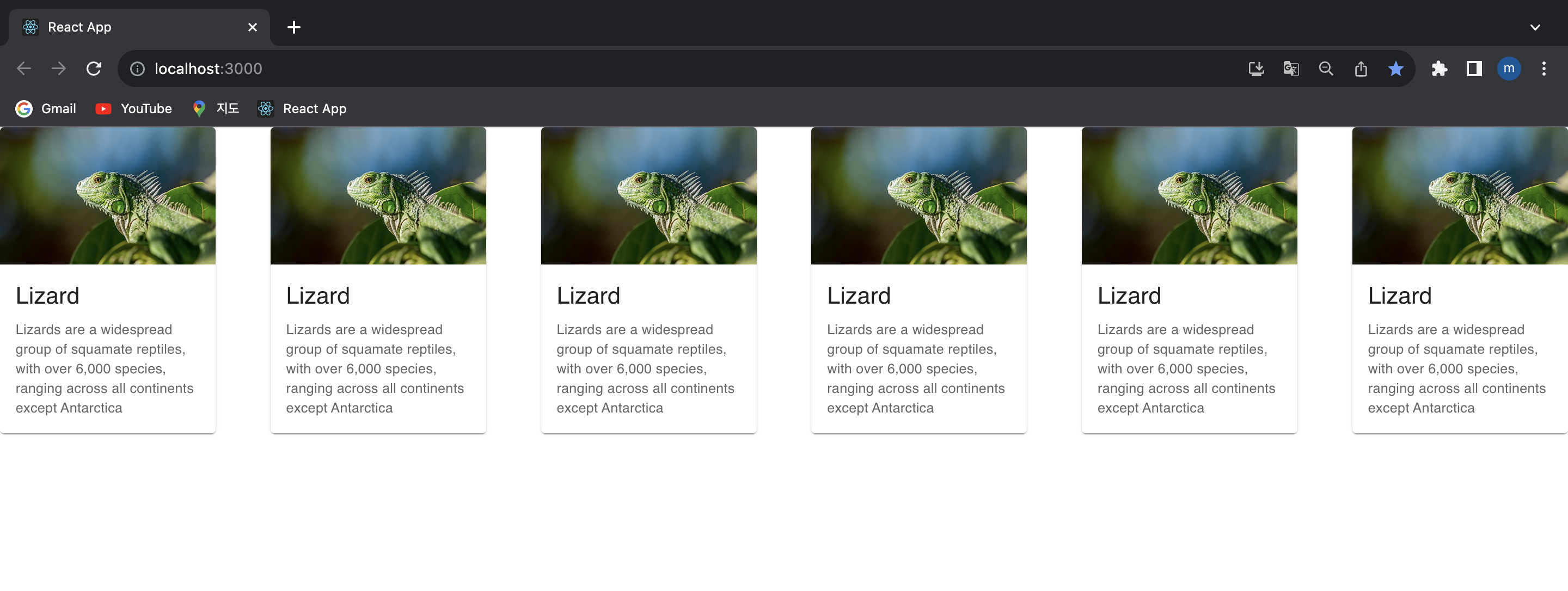
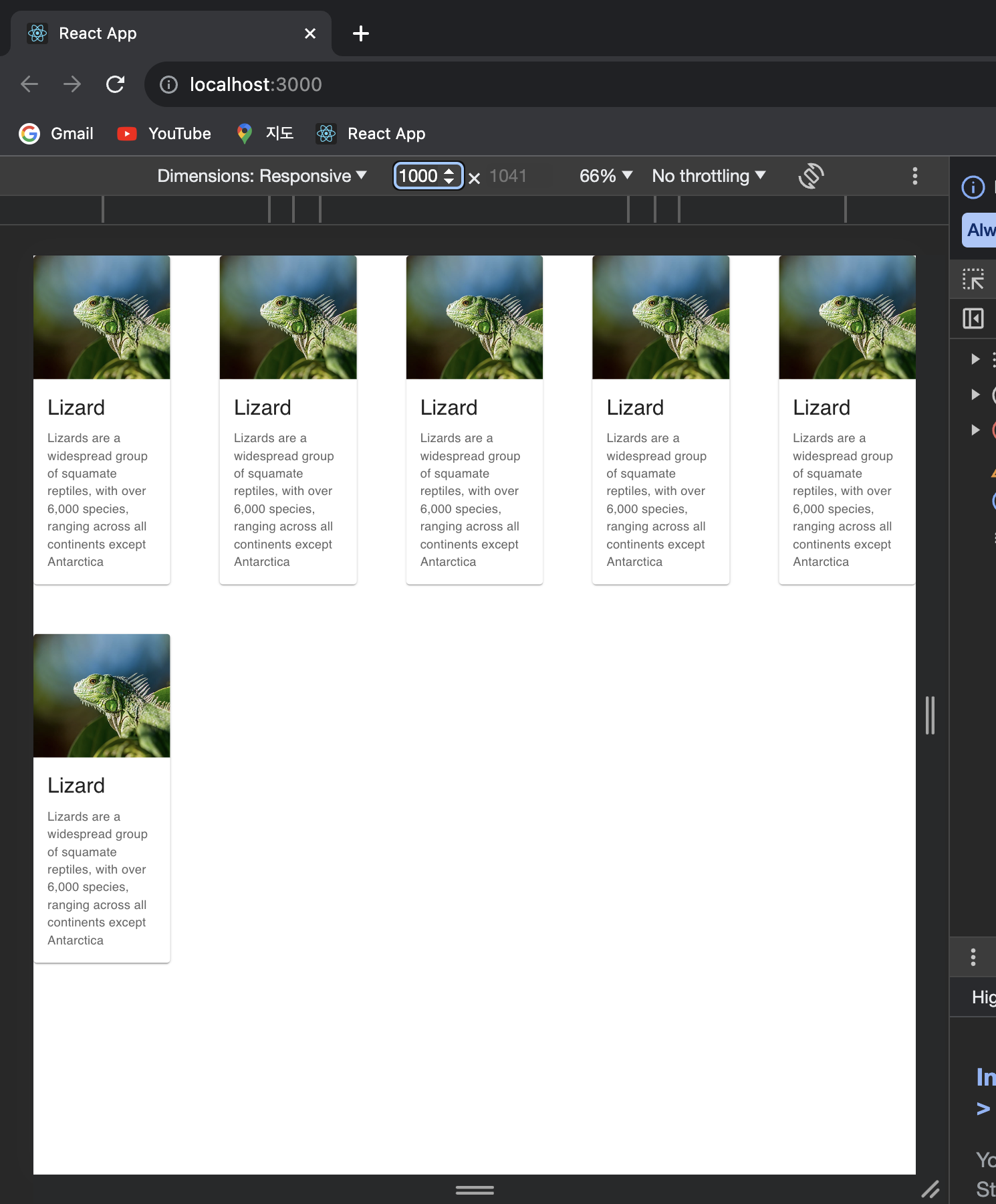
md는 Medium을 의미한다. Material Design은 유연한 디자인을 지원하기 위해 픽셀이 아닌 상대적인 값을 사용하기 때문에 각 단위로 px로 정확히 구분하기는 어렵다. 일종의 가이드로서 md는 960px~1280px 사이에서 적용되는 속성이라고 받아들이면 되겠다.
코드에서는 md={2.4}로 설정했기에, 데스크톱 사이즈에서는 한 row에 카드가 5개 정도 나열될 것이다. 1000px로 설정했을 때 위에서 예상한 결과가 도출됨을 확인할 수 있다.
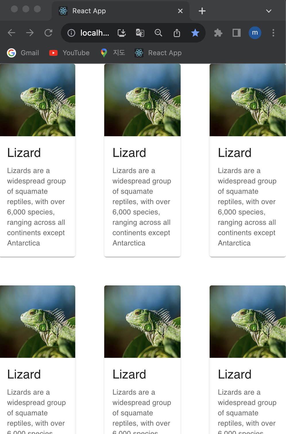
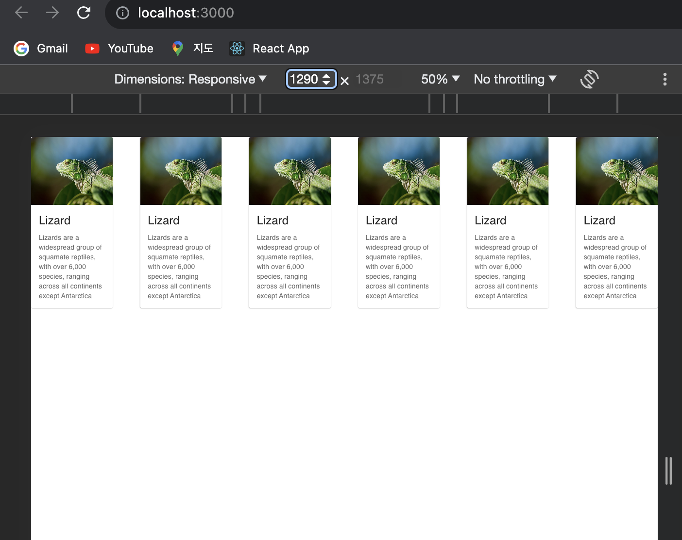
#### 2-5. lg(대략 1280px~)
lg는 Large이다. 위 코드에서는 각 item에 대해 lg를 2로 설정했기에, 1280px 이상 정도의 큰 화면에서는, 한 row에 6개의 카드가 나열된다.
3. 요약
1. Grid는 MUI에서 레이아웃을 잡을 때 사용하는 컴포넌트이다. 2. 상대적인 width(xs,sm,md,lg)마다 컴포넌트의 배치를 설정할 수 있다. 3. 공식문서 layout part를 모두 따라해보자.
More to read
프론트엔드와 백엔드 사이
HTTP 상태 코드는 프론트엔드에서 백엔드로 보냈던 요청의 수행 결과를 의미하는 일종의 약속이며, API를 구성하는 핵심 요소 중 하나입니다. 상태 코드와 관련하여, 백엔드는 잘 모르는 프론트엔드의 슬픈 사정이 있습니다.아래는 요청이 실패했음에도, 백엔드에서 상태 코드
JWT토큰 관리 방식 톺아보기
0. 들어가며 🎯 서비스에 접근하려는 사용자가 누구인지 확인하는 과정을 사용자 인증이라고 합니다. 인증된 사용자에게 주어진 권한을 확인하는 작업은 인가라고 부릅니다. 이번 글에서는 인가는 다루지 않습니다. 사용자 인증에는 많은 방식이 있지만, 오늘은 세션 인증 방
A2AA2A / MCP 멀티 에이전트 오케스트레이션
0. 들어가며 ✍️ Google for Developers에, 레스토랑 공급망 시나리오로 엮은 6대 프로토콜(MCP, A2A, UCP, AP2, A2UI, AG-UI)에 대한 가이드가 게시된 이후, MCP와 A2A부터 구현해 보는 것이 좋을 것 같다는 생각이 들었습니